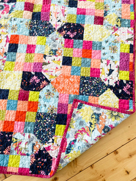
The Red Fort of Agra was the first modern quilt I ever designed. For this reason it holds a special place in my heart. The Red Fort of Agra can be tapered down to a simplistic look, or it can easily have a fun and crazy look. It all just depends on what look you want and what fabrics you love. Take a look at my versions of this beginner friendly, modern quilt pattern.
If you want to read about the inspiration of the Red Fort of Agra Quilt you can find it here.

My first version of Red Fort of Agra
The key to this pattern is choosing two different groups of fabrics that match, but also are distinct. Obviously you can make the pattern with all the same fabrics, but the main design won't stand out as much. I do know some quilters do not like contrast in their quilts. So if this is you ignore my thoughts and choose the fabrics you love.
However, I do like a nice contract in quilts. To be honest this quilt is always a bit of a challenge for me to choose fabrics for. I am red and green color blind, so a lot of times I will choose some fabrics then find out my "red" is actually orange or my "gray" is actually green. I have 0 confidence when matching fabrics, especially this many. I usually recruit help or choose bundles already curated.

The first version of Red Fort of Agra was made without a pattern, but with curated bundles. I had already bought Art Gallery Fabric's Nightfall line by Maureen Cracknell and a bundle of solids that all match. This is one thing about Art Gallery Fabrics I love! All their lines have matching solids and blenders. The best part is it's all listed on their website. So if I see a new line of theirs I like I can easily buy the complimentary solids or blenders.
Also, many stores including, the Fat Quarters Shop will list bundles of Art Gallery Fabrics with complimentary fabrics or solids. This is a great way to quickly grab some fabrics, if you are color challenged like me, without having the stress of wondering if they match.
All right, back to the first Red Fort of Agra quilt. You can see from the image above that I used solids for the larger squares (fabric A in the quilt pattern). I used the Nightfall line for the smaller squares (fabric B in the quilt pattern). I like how this really makes the pattern stand out. Also, the Nightfall fabrics were great for those small squares because many of the fabrics had smaller scale patterns on them.
I also only quilted the larger squares with straight line quilting. You can't really see it in this picture (the quilt is in India so I can't show you up close or take more pictures) I did not do any quilting on the Fabric B (Nightfall fabrics). I don't like it when quilts look overdone. I love the Nightfall fabrics and wanted their beauty to stand out, so I didn't want to distract from them by quilting over top. Some people may say the whole quilt needs to be quilted for wear and tear, but when I make a quilt, if it's for my enjoyment, then I make it the way I want it to look.

Second and scrappy version of the quilt.
Moving on... the second Red Fort of Agra I made served the purpose of actually writing the pattern. LOL! I should have written the pattern while I made the first one. But I didn't. So a year, a child, and a move later I remade the quilt trying to remember all the measurements I used the first time. You can read more about this quilt here.
Fabric selection for this quilt was a bit harder, but also more satisfying for me. I wanted the quilt to be more scrappy looking than the original. All the fabric came from my stash, and it was all by the current designers for Ruby Star Society (this fabric is by Cotton and Steel before they moved on). I added a couple fat quarters in by other manufacturers if I needed more of a color. At this time I had quite a few lower volume, neutral Cotton and Steel fat quarters. So I decided to use these as Color A. As long as the main color was gray, peach, cream, white, really anything lighter in color, I threw them in. I then chose my Fabric B fabrics by grabbing anything that looked like it might go together, blues, reds, golds...

This quilt is a bit busy looking, but I love it. It has the scrappy feel and contrast I wanted. However, because the Fabric A squares are lighter, it's harder to see the detail of the pattern, especially in photographs.
Next up, I made the Red Fort of Agra in a small, throw size. For this quilt I bought a small jelly roll from the Fat Quarter Shop of the Aviary Line by Ruby Star Society. Since I loved all the fabrics in the line this was a great and cheap way to get all the fabrics. I then chose fabrics from their Spark line that I thought would match the Aviary line. Because the Spark fabrics are blender fabrics there is a nice contrast.

This version uses the Aviary and Spark lines by Ruby Star Society.
This version might be my favorite. The contrast and colors really make the pattern pop.
For my fourth version of this quilt I again used a small, Jelly Roll to make the small, throw size Red Fort of Agra quilt. I had fallen in love with the Stellar line by Ruby Star Society and again loved ALL the fabrics in the line. For the Fabric A squares in the quilt I had wanted to use low volume blenders like the Spark and Add It Up lines. However, the fabrics I had chosen didn't match quite like I was hoping. So we took out the ones we weren't sure about and went to the local quilt store to add some more. I was able to find some yellows and blues from other manufacturers that went really well with the Stellar line.

Look at all those bright colors!
This version is by far the brightest and most fun. The quilting Kaitlyn from Knot and Thread chose pulled it all together.

As far as a contrast this quilt doesn't have a huge one like the others I made. I feel like the blues really stand out compared to the yellows and pinks/peaches. If I wanted a better contrast I think the blues probably should have been used in either Fabric A or B but not both. But all that to say, this bright and cheery quilt still turned out beautiful and the design of the quilt is still quite visible.

Above is my last Red Fort of Agra modern quilt. This one is also quite busy. But I wanted to try to use a new line by Art Gallery Fabrics called Pollinate. I love this line and it's bright colors. I chose 7 fabrics from the Pollinate line, then added solids or blenders that matched. The blender/solid fabrics were used for the smaller (Fabric B) squares and the patterned fabrics for the larger (Fabric A squares). The vibrancy and brightness of this quilt is unmatched! The colors just pop out like party of colors. I love it!
I hope this little tour of my Red Fort of Agra quilts and fabric selection helped you. Show me your quilts on Instagram (@thenomadicquilter). I can't wait to see what fabrics you choose.
